Selected Work
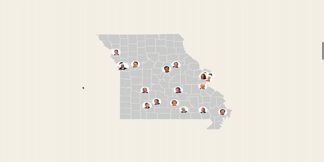
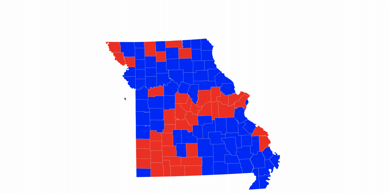
Debate: "Missour-ee" vs. "Missour-uh"
Missourians still can't agree how to pronounce the Show-Me-State's name. Is a local's use of "Missour-uh" versus "Missour-ee" a result of Missouri's rural-urban divide? A predictor of the speaker's political views? Used: D3.js, Illustrator, Sketch, Wacom Drawing Tablet.
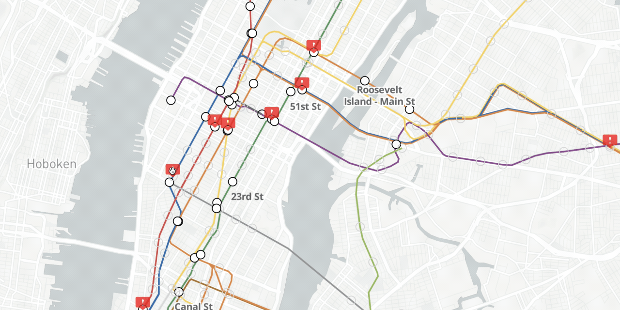
Interactive: Wheelchair Accessible Subway Stops - with Elevator Outages
A grim reality for those who rely on elevators to access NYC's subway. Used: Python and Cron to scrape MTA's posted outages; Mapbox to recreate the iconic subway map.
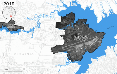
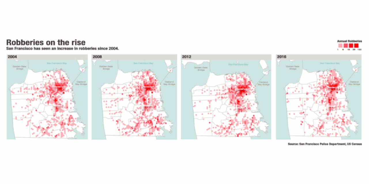
Rising Seas Threaten Key Military Bases
How sea level rise will impact key military installations located along U.S. coasts, based on projections of unchecked climated change. Used: QGIS, Photoshop, Illustrator

Motion Graphics: Career How-To Series
I filmed, produced, and edited an interview with an expert in the security field on having a career in Washington. Used: Adobe Premiere, Illustrator, and After Effects.
D3.js: Visualization Playground
Visualizations created for indepdent projects and Lede 24 classwork. Used: D3.js, Node.js, HTML, and CSS.

QGIS: Quick-Turn Maps
Select classwork for Columbia Journalism School GIS class taught by Jeremy White. Used: QGIS and Adobe Illustrator.
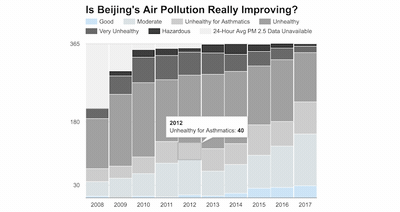
Twitter Scrape: Verifying Air Quality
A scrape of the U.S. Embassy in Beijing's feed of air quailty readings to see if small particle air pollution has improved, as reported. Used: Python, Jupyter Notebook, Google Charts.
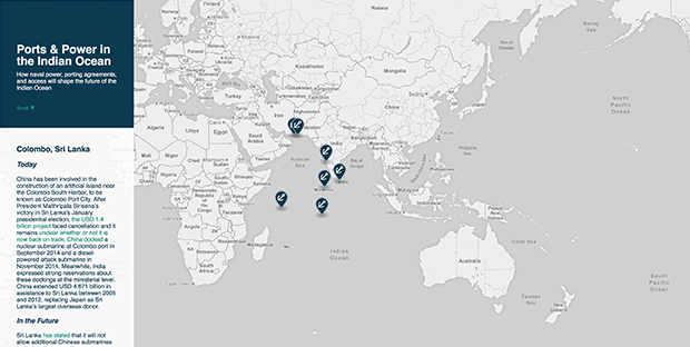
Scrollytelling: Indian Ocean Port Explainer
Interactive map published by the Center for Strategic and International Studies and the Asia Maritime Transparency Initiative. Used: Mapbox, HTML, and CSS.
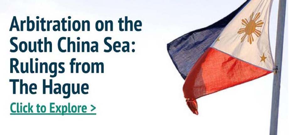
Design and Research: Arbitration Explainer
Explainer published by the Asia Maritime Transparency Initiative. Used: Bootstrap, Adobe Illustrator, and open source research tools.
Writing and Analysis: Women and the One Child Policy
Analysis and research guided by experience working in China. Used: Microsoft Word and open source research tools.